11/09/2012
For the film opening that will be created, I will be working with Charlie Spooner and Gabriel Lindsay. In order to design the opening and closing credits, we have focused on effects in openings in films such as 'Catch Me If You Can', 'The Girl With The Dragon Tattoo', and 'Casino Royal'. The genre of the film has not been clearly decided yet.
12/09/2012 RESEARCH: GENRE
In today's media lesson, we studied the opening sequences of film genres, mostly thrillers. Namely, 'Don't Look Now', we studied numerous effects used in thrillers to increase tension and build suspense.
13/09/2012 RESEARCH:SOUND AND VISION EDITING
In the lesson, we watched the opening sequence of the film, 'Love Actually'. We noticed that various effects such as slow motion was used, and along with the romantic music, it created a sentimental quality. We also noticed where details about producers and studios came in, as well as when the title comes into the screen. Along with 'Love Actually', we also watched the opening sequence to 'Ae Fond Kiss' and studied the different types of voiceovers including speech, a famous person speaking, a song, the sound from a TV, and the radio.
18/09/2012 RESEARCH: THE ART OF THE TITLE
Tonight, I’m going to continue studying the website, ‘Art Of The Title’(www.artofthetitle.com/), and work on how opening sequences work. I was especially interested by how opening sequences usually consists of extreme close shots of people and objects, as well as a sound track that creates the atmosphere.
In class, we
studied the opening sequence of ‘Delicatessen’ (1991). What I liked about the
sequence was how a slow pace panning of the camera along with its instrumental
sound created a mysterious feeling to the film. I also noticed how so many
objects were used to hint to us what the film would be about. The credits and
names of the casts were written on the materials that came out in the opening
sequence such as a ruler, newspapers, paper labels, and so on. The color tone
of the opening was very dark and dusty, which brought about a gloomy feeling.
The opening shot of the montage was very striking because it shows a butcher
holding a knife like a killer. As he brings down the cleaver, the percussion
marks that moment. This establishes the film’s genre as black comedy.
The film I.Robot is a si-fi fim considering a possible scenario in the future where humans coexist with robots. The opening sequence features a robot saving a drowning person from a car, which is the main character's memory of what happened during his early ages.
There are many factors of this sequence which makes it distinctive, and attracts the attention of the viewers. First of all, the movie making company and the name of the directors come up very naturally as bubbles in which the character is drowning. Since these texts came up before the cars and people appeared in the sequence, it pops up a mysterious question of the connection between robots and water. Another very important factor is the sound used in the opening sequence. There are no voice overs or sounds of words, but only electronic sounds of echoing and what you might hear underwater. All of the sounds combine to create a very horrific atmosphere which at its most even worries the viewers of what might happen later on in the film.
The film Ginger Snaps(2000) is a horror film using a metaphor between werewolfism and puberty. The opening sequence of this film shows very graphical details of many homicide/suicide scenes that occur in the film. Although the details of the sequence are very frightening, every little detail from the camerawork to editing tells us something we should learn about.
First of all, when the sequence starts, a very low tune instrumental music starts playing, as if to resemble a funeral or a mourning of a tragic event. Along with this background music, there are spot sounds here and there including echos and screaming to embed fear into the viewer's minds. The screen features dead people, in great details almost directly explaining to us what happened to them. These include the girl who who got flattened by a car, as well as the one with excess amount of pills in her mouth. As the clip commences, the soundtrack shifts slightly, into a more energetic tune. Drums start playing in the background along with the instrumental music from the very beginning, and more electronic sounds are edited into it. For instance, as the screen changes from one death scene to another, high pitched sounds are used, as well as a little girl laughing. The viewers watching this don't exactly know what and why such things are happening, but are scared, and want to know more about this horrific mystery. This opening sequence had a very strong affection to me because I personally thought it was out of the ordinary. It exposes alot of the film's content, yet doesn't tell us anything about the moral or the secret behind the film, which is left for the viewers to watch and decide. Also, since the graphical details are so strong, photographic memory is stimulated. This helps because along with the photos, the name of actors and directors co exist naturally with the background of the film. Even though the opening sequence was very scary and perhaps disgusting, I thought the idea was worth respect.
The film Napoleon Dynamite (2004) is a comedy film featuring a teenage boy from a bizarre family background, and entertains viewers by his stupidity and random turn of events. The sequence itself, like the movie is very easygoing and hints to us what kind of person the main character is.
The opening sequence for the film is structured in a very creative way featuring many objects where we would commonly or rather not see writing of some sort. As the clip starts, a person's hand puts plates of food on a rug and details about the cast and directors are written with dressings such as ketchup along with hash brown and mayonnaise with eggs. He then takes out a wallet with another cast's details and shows his own id card which gives us the basic impression of what kind of person he is. He shows library cards, where the person borrowing the book turns out to be the name of casts' names as well. The sequence ends with another plate of food, as so the start of the sequence showed. The soundtrack to the opening sequence is very slow and relaxing. You don't feel any busy things going on, and are overall relaxed. This is very important because it presents a very clear atmosphere of the film along with the things going on, on the screen.
19/09/2012 PLANNING: INITIAL BRAINSTORMING
In the lesson today, we started to look deeper into the projects that our group are supposed to do which is: to create an opening sequence for a (horror) film keeping in mind the numerous camerawork, editing, and mise-en-scene involved. Our group consisting of me, Charlie Spooner, and Gabriel Lindsay decided to create an opening, possibly of a girl who has lived throughout the ages and is immortal; she will burn pictures of herself to destroy evidence of her past.
20/09/2012 PLANNING: TIME BACKGROUND
Today we commenced on the topic of our project and decided major details such as what timeline in history we will use in the opening. Ideas that came up included the timeline starting at the start of 1900s, somewhere around 1930, around the post-war era of the 1940 ~ 50s, possibly 1980s, and the modern 2012.
25/09/2012 PLANNING: MINOR PROPS
Today's lesson involved more brainstorming on the basic structure of the project. From last week's planning, we achieved to the point where we knew exactly what timeline of history would be featured in our opening. As for this, we started working on the minor details of each era and what props would be used to make this more realistic. First of all, we decided that at the start of the 1900s, the girl in the opening would be in France. Props such as a picture of the Eiffel Tower and wine are expected to be used to emphasize that the person is in France. We planned to fit in a wedding photo of the girl along with her partner at the 1930s era and her holding a newspaper that reads 'War is over' at the 1940 ~ 50s era. At the 80s, we decided to take a picture of the girl next to a poster of a club that was very popular during the time, and finally for 2012, we planned to feature her in front of a modern architecture such as the London Eye to clarify the timeline she is in. All of the props will be made by ourselves and we've planned if needed, we would travel out of school to take needed photos.
26/09/2012 PLANNING
Today, our group simply discussed the very minor details about the opening and clarified any measures we did not wish to include. We decided not to use the 2012 picture, and had a debate about the title of the opening sequence.
27/09/2012 PLANNING: CREATION OF THE STORYBOARD
In the lesson today, we made a picture board using an A3 sheet as the main background and post-its. We drew every scene into a post it and wrote brief notes about it; when we were done we stuck each of the post-its in timeline order to illustrate the picture in our minds of what would be featured and how it would be done. For instance, we included minor details about the camera angles in each situation from the start to beginning, and where spot sounds would be used to make an object symbolize importance.


2/10/2012 RESEARCH: FASHION
Today's lesson just consisted mainly of recap and organising the ideas we planned out throughout the prior 2 weeks. We now have a clear insight of what we are going to do, and we are absolutely confident in what parts will be done in which way.
3/10/2012 RESEARCH: WEBSITES
Today out of interest, I decided to start collecting ideas and images for my mise-en-scene. First, I investigated online pinboard websites for housing my ideas such as tumblr, flicker, pinterest, and scoopit. Our group is not completely positive about these sites and are not sure if we want to use it for our project.
4/10/2012 PLANNING: JOBS IN CHARGE
Our group decided what we would each do for the making of our project. First, we thought of the different time scenes that would feature in our opening sequence and decided that we would each choose a time and create the props needed for it. I chose to be in charge of the 1900 one which features the girl in France. I started out by choosing a picture of the Eiffel Tower and photoshoped it so that it looks suitable for the 1900 era. I also observed other photos of Paris as well as suitable pictures where a girl could be photoshopped into.
 |
| Girl as main character |
 |
| 1930s Marriage |
 |
| 1960s Disco |
 |
| Police featured in the opening |
3/10/2012 RESEARCH: WEBSITES
Today out of interest, I decided to start collecting ideas and images for my mise-en-scene. First, I investigated online pinboard websites for housing my ideas such as tumblr, flicker, pinterest, and scoopit. Our group is not completely positive about these sites and are not sure if we want to use it for our project.
4/10/2012 PLANNING: JOBS IN CHARGE
Our group decided what we would each do for the making of our project. First, we thought of the different time scenes that would feature in our opening sequence and decided that we would each choose a time and create the props needed for it. I chose to be in charge of the 1900 one which features the girl in France. I started out by choosing a picture of the Eiffel Tower and photoshoped it so that it looks suitable for the 1900 era. I also observed other photos of Paris as well as suitable pictures where a girl could be photoshopped into.
 |
| This is my Audience Profile: my target audience is aged 15 ~ 35 |
9/10/2012 RESEARCH: CALL SHEETS
Today, we studied about the production of 'call sheets' when making our project. Call sheets are documents containing all the information about a certain project including the items needed for it, time and place of the shooting needed in the film, and the contact information of the people involved. We were set a task to each make an individual call sheet on one of the frames in the opening sequence.
10/10/2012 RESEARCH: INTO THE EXAM
In the lesson, we studied about 'articular reflection'; of which the exam moderator is looking for. This can be widely defined as how well the project contains skills and connection to our target audience.
11/10/2012 RESEARCH: OPENING SEQUENCES
 Today, we looked at the opening sequence of 'Zen' by BBC. Zen is a TV series broadcast in the UK in 2011 featuring a crime story that bases its background in Italy. First, we compared and contrasted the difference between the opening sequence of films and TV series. We came to the conclusion that film opening sequences connect to the film itself and acts as an introduction. However, in TV series opening sequences, it doesn't connect directly into the show itself due to the fact it is broadcast every episode, meaning it realistically must be kept simple. The interesting parts of the opening sequence include the switching of scenes. For example, at the very beginning, there are stripes that change the scenes directly and introduces the cast at the same time.
 16/10/2012 PLANNING: CREATION OF PROPS
I printed out a black and white picture of the Eiffel Tower as one of the props to be used in our group's storyboard. We thought it would be important to include minor props as well such as maps, pictures, and pieces of writings to make the opening sequence more realistic.
18/10/2012 PLANNING: PHOTOGRAPHY
I took pictures of the girl that would feature in our opening sequence in different angles to use in my 1900 era. I will be working to photoshop her face into a certain picture that meets the era; the thought in mind being, her in front of the Eiffel tower.
7/11/2012 PLANNING
In today's lesson, we focused more on how we should prepare for an 'opening sequence' of a film rather than part of the film itself. We watched the opening sequence of the film
8/11/2012 PLANNING: IDEAS AND USE OF PROPS
Today we focused on the ideas about the project and the props used. The ideas that will possibly be used: Jenny invites the policeman into her house and he takes a sip. The policeman's head falls to the table. To prove that the background is in modern times, you see a picture of the modern house and hear the fist - knocking on the door. Props that will possibly be used include a pearl necklace, a wine glass, a wine bottle, and clothing from different eras such as the Edwardian times.
13/11/2012 - 14/11/2012 PLANNING: CHANGE OF IDEAS
Today, we decided to lead our ideas in a slight different direction and changed the theme from an immortal woman to a criminal involving jewels. We will be using shots such as setting different props in a straight line along a table and panning across to show the different credits.
Props needed for the tracking shot
※ Items highlighted in orange are the items I will be providing
Jewelry: (On woman's dressing table) Pearl drop pendant, various perfume and jewelry cases, ribbons, soft jewelry pouches, string of pearls, velvet jewelry tray, blue leather antique jewelry case, rings, brush and mirror dressing table set,
Clothing: Antique lace handkerchief, blue silk negligee, masks, pair of jewel bedded slippers, (wedding shot) wedding dress, veil, man's outfit, handbag and gloves
Household objects:
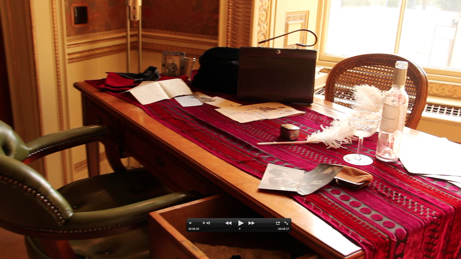
Other Props: (On the table) Wine glass and bottles, gun, restaurant matchbox, restaurant card, pack of cards, antique French sheet music, framed photographs
2. Man puts necklace on woman's neck
3. Woman pours a glass of red wine for man
4. Close - up of woman's hands touching the jewelry collection
5. Woman steals from jewelers (handbag, jeweler's try, jewelry)
Today, we decided that we would do our long tracking shot in a small silk - lined room with antique furniture. We will use an antique Chinese looking desk as the woman's dressing table. On it we will place a selection of jewelry and on the chair in front of it, silky clothing. On the floor, we will put jeweled slippers. The camera will then track to the adjacent desk on which will be the woman's handbag, sheet music, wine glass, hat, and so on. We will have 5 brief live action shots.
20/11/12 PLANNING: SHOOTING
Today we organised the location of the shooting of the dressing table and what we will use for it. The idea that we have in mind is the headmaster's office in the school mansion and the dressing table is located inside there. We couldn't do any shots today because of the fact the room was locked, however we are planning to make further appointments with the school to take shots there. We have also organised a number of our props from small objects such as pocket wallets to wedding dresses. Other props that will be used later on in the opening sequence will be added to the current stock that we have.
21/11/12 PLANNING: SHOOTING
Today, we arranged the props that we have on the dressing table and the working table. We designed how it would look on camera. Below is the day of the planning and pictures of the prop table, as well as how it was planned.
| Planning of the 'dressing table' |
22/11/12 PLANNING: SHOOTING
We planned a shot somewhere around the start of December (4,5,6th) which will take place in the headmaster's office with Jenny Adams as our actor. We thought the room would be suitable for the filming and it provides the props such as the working and dressing tables.
4/12/12 PLANNING: TO DO LIST
 |
| To Do List |
 In today's lesson, our group produced part of the opening sequence which will come after the ident to introduce the cast and producers. The ident consists of two parts, the first introducing the CFC productions and another introducing GCG studios. The idents that will be used are shown. The part of the opening sequence that we produced introduces the name 'Gary Na' as part of a Daily Mail article and was done using the program, photoshop.
6/12/12 PRODUCING: FILMING
Today, we filmed the first part of our opening sequence where we use a panning shot over the dressing and working table. We did a total of about 6 shots with different category of shots including extreme close - ups on important props that make up the set as well as objects that tell us about the story itself. The room was very suitable for the project with an old - fashioned image, but the lighting was a bit weak due to the fact we forgot the use of lamps and other light sources. We also filmed the 'Daily Mail' in the opening sequence and will be using it in our project prior to the panning shot.
11/12/12 PLANNING
In today's lesson we looked over the videos that we took with the panning shot and noticed a few problems. First of all, we agreed that the use of close ups is not a good idea because it wasn't smooth enough and the focus wasn't very clear either. Also, the panning that we each carried out was too fast and did not take in to account the whole image of the shot. The biggest problem was that some of the footage were lost in the process of delivering it to the computers in the media rooms. We are planning to learn from these mistakes and repeat the shots another time when it is possible.
15/01/13 RESEARCH: SOUND TRACKS
Today we explored through sound tracks and how modern music could possibly create a harmony with an old fashioned screening. We were trying to look for a soundtrack that was instrumental, mostly through the sound of pianos. Initially we planned to use Adagio For Strings by Samuel Barber but we decided to use a different track. In this process, we looked at opening sequences of films such as 'Les Blues De Ramville' and 'Gangster Squad'. We want a soundtrack that is slow pace, doesn't have or doesn't have too much vocal in it and has an emotional feeling to it.
PLAN: Girl sitting down on a table, walks out the door, man walks in shoots her slams someone on the table and they start to bleed.
We also planned part of the opening sequence. We were having some trouble thinking of the overall story line of the sequence, so had to plan out and design one. We thought of a scene where we would have voice-over over a scene where the son of the 'criminal' discovers evidence from his mother's past many years after her disappearance. He discovers her real name (ideally Russian or Spanish). The voice-over will continue even when there is the woman on screen. There is also a scene of the woman in a wedding dress coming down the steps. This will be in slow - motion and in black and white. The final scene would be a fight between the character's mom and her lover. The husband didn't know she was a thief.
17/01/13 PLANNING: DESIGN
Today, we set up the props for both the dressing and study table in our media class and took pictures of them. This has no special use in the opening sequence that we are creating but rather to have a basic insight of the items that will be used in the sequence. (Pictures need to be put up)
22/01/13 PLANNING: FONS
 In today's lesson, we looked for fonts that will be used in the opening sequence. We chose one that would be suitable for Thriller openings and the clip that will be running in the background. Recently, I have been using my media twitter to follow certain pages such as HMV, a British Multinational entertainment company which has recently been a hot topic due to its possible bankruptcy and existing debts, and Mediaguardian which is a branch unit of the news company, The Guardian that provides information about the Media issues today.
 23/01/13 PLANNING: USING SCOOPIT
In today's lesson, I continued gathering sources for my Scoopit on Thriller codes and conventions and finished it. The following screenshots show the finished work and the information that it includes. In the process, I learnt about many useful media websites from the BFI Screenonline to Educational sites such as Mediaedu.
 |
| Completed Scoopit page |
 |
| Completed Scoopit page (cont.) |
Once you use the Scoopit program, you can add tags to your interest on the page. This means that when I make a new scoopit I can easily find websites providing the information I need. For instance, when I was making the scoopit for the code and conventions of thriller films, many websites including information on the tags that I added came up on the suggested content as shown on the right.
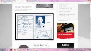 Additionally to the Scoopit program, I looked at the International Spy Museum, which is based in Washington DC, USA. This had direct connections to my group's project which involves a jewelry heist and possibly spies. In the process of researching this website, I found a very valuable piece of work that the museum has provided. It was a profile of a spy that has previously existed. I thought that it would be possible to photoshop the spy in our project into the picture to make a good prop.
 24/01/13
Today I reviewed the whole of my production log and fixed all grammatical and spelling mistakes that I could find. Additional to this, I added the directors and the year of all TV series and films that are mentioned in the text. This was done by importing all my data on the blog to a Microsoft Word document and using the spell-check option.
29/01/13 PRODUCING: DESK SCENE
Today we filmed the scene where the woman(Jenny Adams) in the film puts on a pearl necklace in front of her table with a mirror and other jewelry. We did this in the media room in school meaning the background wasn't suitable, especially when the mirror on the table would reflects what is being shown behind the camera. To resolve this problem, me and Charlie got a green clothing and held it from two sides to make a suitable setting. We went on top of desks so none of our image was shown on screen.
In this filming, Jenny went in the wedding dress of which the same one will be used in 2 days to film the actual wedding scene. This was done because we planned to use the wedding scene as an incident that happened in the past and edit it in black and white. The clothing she was wearing and the set was very suitable for the part of the scene.
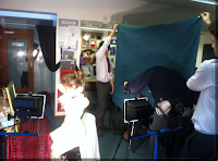
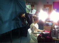
Holding up a cloth to hide the background Lighting was used at high levels
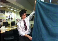
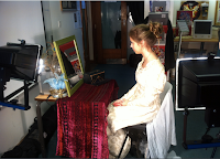
Covering the background Adjusting the lights
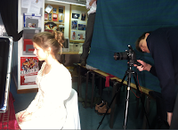
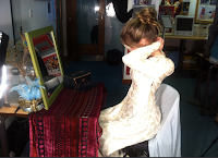
Mid shot of the woman Over the shoulder shot
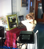
Mid shot of putting on pearl
30/01/13 PRODUCING: INTERROGATION SCENE
In today's lesson, we filmed a scene where a lawyer / investigator meets with the son of the mysterious woman featured in the opening. This was done in the Drama production room of the School using the old-fashioned looking desk. We were limited on clothing and just decided to use our school uniforms as blazers. This was only possible because only one of the two characters would be in the frame at once. To hide the school logo, we taped a white piece of paper on it and used a name-card like that of a worker to cover it up. The people in this scene of the film were me and Charlie Spooner, Charlie being the son of the woman.
31/01/13 PRODUCING: MARRIAGE SCENE
Today was the filming of the marriage scene which was carried out in the school front steps and in the inner hall. I had made the call sheet for this 2 weeks ago for prep and this provided information on what props and filming equipment we would need.
In this part of the film, Jenny Adams, featuring as the bride dressed into the wedding dress used in the table scene prior to this scene. The dress was long enough so that we couldn't see her shoes, meaning there was no need to separately prepare appropriate footwear.
As the groom, Charlie Spooner dressed into a East - European style suit with a hat giving a Russian style. This was done so that his costume didn't look too modern, respected to the fact the background of this scene is years in the past.
In the inner hall, we didn't require additional lighting because the sunlight coming through the windows was effective in giving a church - like feeling. We made numerous shots from panning to tracking and extreme close - ups on the hand with a ring on it.
On the front steps, we filmed the two coming down the stairs from a lower perspective, and on top of the stairs to show the two going down. All of this was done in black and white to hint to the audience that this was in the past and could even be a flashback of the character.
6/2/13 PRODUCING: EDITING
Today's lesson involved adding music to the video that we edited and organising the sequence of what scenes would come after another. This was done on the School Macs on the program, iMovie. This is also the program that allowed effects such as black and white, speed acceleration and deceleration, as well as strong colour contrasts.
Final Presentation: http://www.slideshare.net/Garrymedia/media-final-portfolio?utm_source=ss&utm_medium=upload&utm_campaign=quick-view


No comments:
Post a Comment